Initial Set Up
After you have set up your site with Sublime go to the Sublime website sites URL and click on the gear cog wheel thing next to your site and grab the loader code
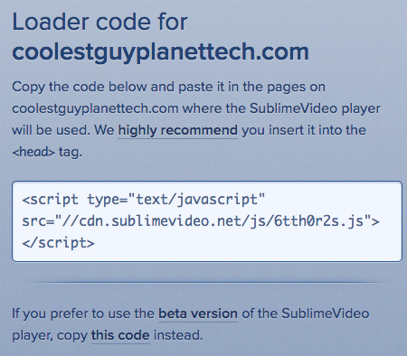
Add that code in between the <head></head> of your document, this will target the code Sublime will generate for you when you go through the video wizard
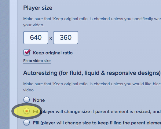
To scale a Sublime video to fit any browser, tablet or mobile device for responsive design you need to check a box in the set up process in the Sublime video wizard tool......
...hmmm, too easy
Take the the video code that Sublime generates for you and place in a div on your page, this example page has the code in a div with a class of .videocontent with CSS:
 .videocontent {
	width:80%;
	max-width: 640px;
	margin: 0 auto;
}
The video sits in a containing div with width:80% and max-width:640px, the width value takes care of the scaling value in proportion to its parent container and I have set the max-width value as I don't want the video displayed as a size beyond 640px. When it hits 640px it is not going any further, conversley you can set the min-width in pixels too.
That's it, below are some plugin extensions for the main CMS systems.