To scale a Wistia video to fit any browser, tablet or mobile device for responsive design you need to enable the responsive setting when generating the code at Wistia for the embed..
Initial Set Up
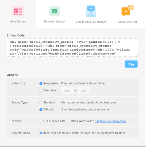
Get your video iframe emded code from Wistia,this page uses:
<div class="wistia_responsive_padding" style="padding:56.25% 0 0 0;position:relative;"><div class="wistia_responsive_wrapper" style="height:100%;left:0;position:absolute;top:0;width:100%;"><iframe src="//fast.wistia.net/embed/iframe/sq50iiqaq9?videoFoam=true" allowtransparency="true" frameborder="0" scrolling="no" class="wistia_embed" name="wistia_embed" allowfullscreen mozallowfullscreen webkitallowfullscreen oallowfullscreen msallowfullscreen width="100%" height="100%"></iframe></div></div>
<script src="//fast.wistia.net/assets/external/E-v1.js" async></script>
Thats it, the Wistia video should scale as the viewport changes.